

Vibe coded Eltropy sidebar experiments
Used Claude design and Vercel to explore the new direction and information architecture of the Eltropy product.
MY ROLE:
As the primary designer on this initiative, I was responsible for:
Problem framing and research plan
User interviews across three personas (frontline agents, domain managers, executives)
Competitive benchmarking
Internal stakeholder workshops
Card sorting and synthesis
Proposed IA structure and rollout plan
Prototype build
TOOLS USED: Claude, Gemini, and Figma
ABOUT THE PROBLEM:
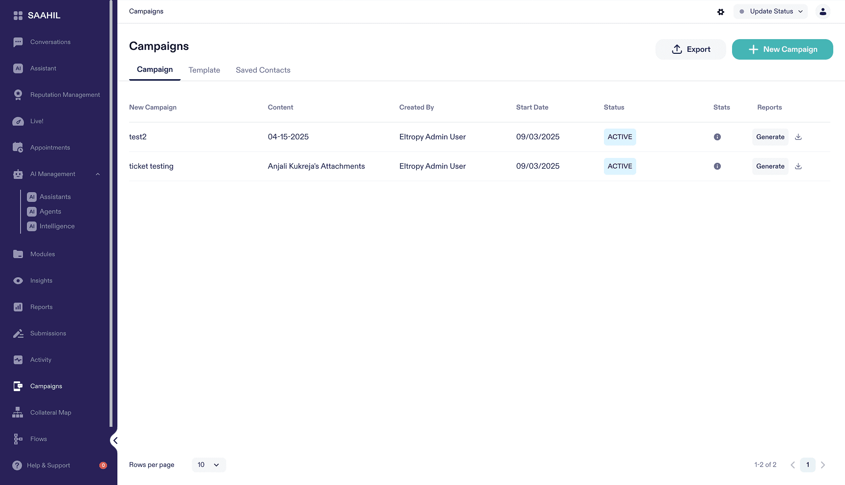
Eltropy's side navigation had grown to 15 top-level items and 30+ total menu entries as the product expanded into AI Assistants, Agents, Analytics, and more — all organized by feature type rather than by how any single user actually works. There was no logical home for new features as they shipped, no way to preview sub-menus in a minimized state, and settings for a single action like onboarding or video permissions were scattered across multiple, unrelated entry points.
Old navigation
THE CONTEXT:
To revamp our Analytics module, we first had to fix a core bottleneck: an unstructured sidebar navigation. Because sweeping navigation changes directly impact user mental models, we couldn't make assumptions—yet tight project timelines and a shared release schedule gave us a very narrow window to execute.
I led a targeted design strategy to balance speed with high confidence:
Focused User Discovery: We concentrated our limited time on direct user research to deeply understand workflow patterns and validate new functional buckets.
AI-Accelerated Ideation: We integrated AI into our design workflow to rapidly generate, stress-test, and iterate on structural concepts in hours instead of days.
By pairing deep user empathy with AI-driven execution, we delivered a validated, scalable navigation architecture within tight project constraints.
MY DESIGN PROCESS:
I started by benchmarking how comparable platforms (Gong, Genesys, Intercom, Zendesk) structured their navigation, then ran internal stakeholder workshops to pressure-test candidate information architectures before taking anything to users.
For primary research, I ran 45-minute one-on-one interviews with 4 Eltropy users spanning different personas, plus feedback sessions with Eltropy's own sales and CSM teams. To validate grouping logic specifically, I ran open and closed card sorting sessions with AI-simulated participants across three personas — 5 frontline agents, 5 domain managers, and 5 executives — treated as directional hypotheses to sharpen the real interview protocol, not as a substitute for it.
Core problem statement:
How might we redesign Eltropy's main navigation so it stays scalable as the product grows, and stays easy to understand for frontline agents, managers, and executives alike?
KEY RESEARCH FINDINGS:
Personal bookmarking solves the scale problem. Every user validated a customizable bookmark feature — letting individuals surface their 5 most-used tools out of 30+ eliminated cognitive overload.
Workflow-based grouping beats department-based grouping. Users preferred structure that followed how work actually happens over grouping by internal department, since it holds up across credit unions with different internal org structures.
Plain labels over clever ones. Header names like "AI Control Center" or "Mission Control" were rejected as overly stylized and disconnected from the operational language credit union staff actually use.
Analytics belongs with reporting, not buried in a generic sub-folder. Contact center managers specifically wanted analytics surfaced alongside reports rather than nested away.
"Intelligence" reads differently across personas. Card sorting showed agents interpreting it as AI features and executives interpreting it as analytics — a signal that it needed renaming to something persona-agnostic like "Insights & Reports," a label that came up unprompted, multiple times, in the open sort.
THE SOLUTION:
Step 1: A workflow-based information architecture
Reorganized the sidebar from 15 feature-based entries into persona-aligned groups — a personalized AI Assistant homepage, Member Conversations (inbox, telephony, appointments), Operations (live dashboard, interaction history, knowledge hub), Marketing (campaigns, reputation management), Insights & Reports (analytics, data export, reporting), and a dedicated AI control center.
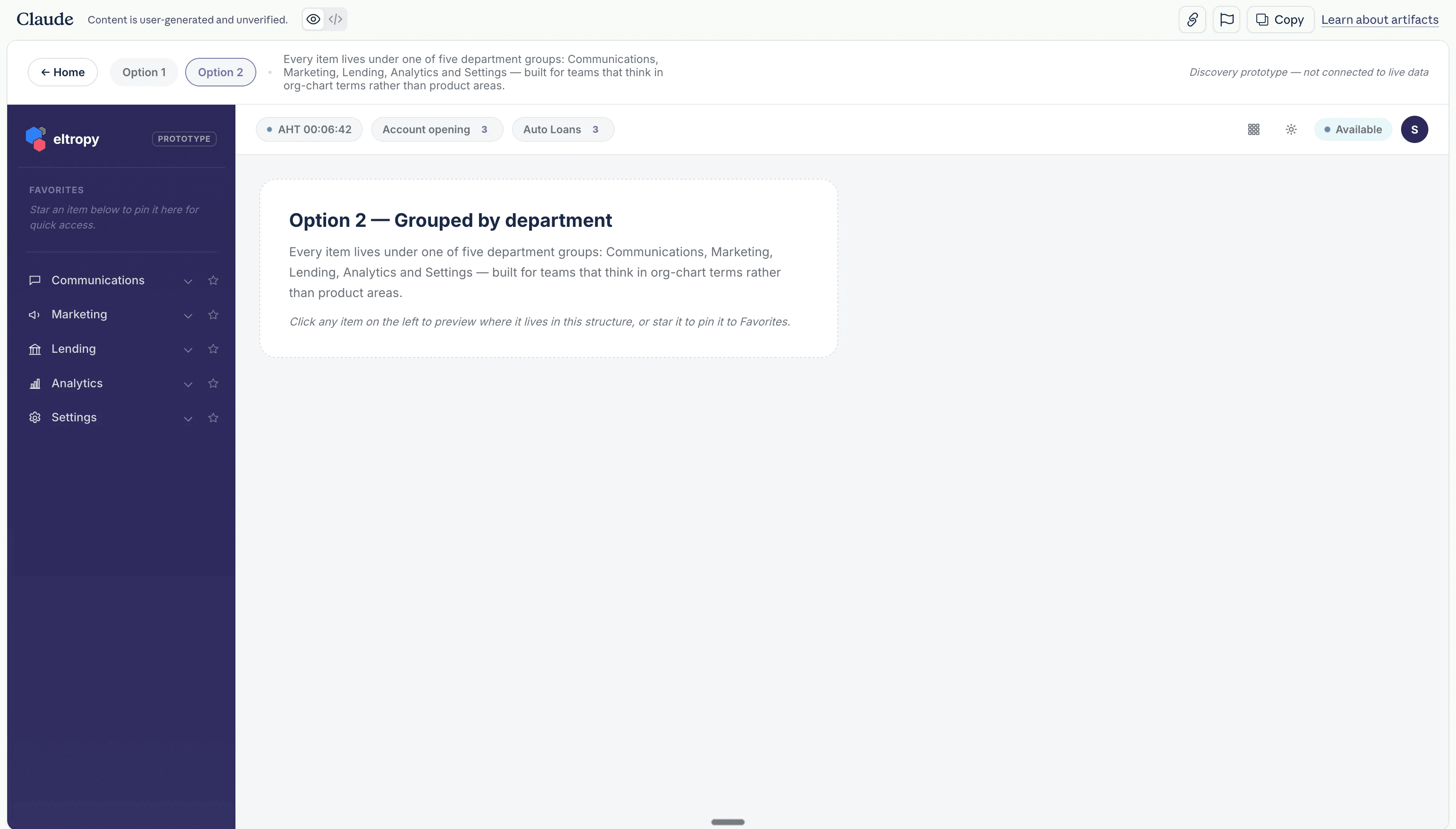
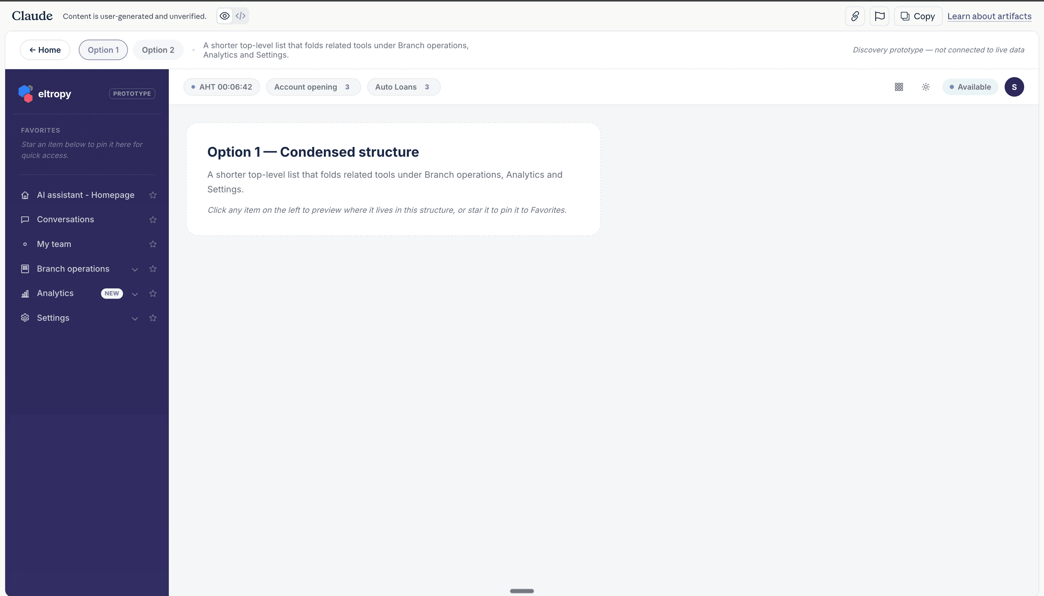
Step 2: A rollout plan designed to de-risk adoption
Modeled on Zendesk's approach: an opt-in early access program with badge-driven discoverability and automatic QA requiring no user action. New accounts would get the new navigation immediately; existing customers could opt in voluntarily for a few weeks before the change became permanent by end of 2026 — giving people time to toggle back if needed.
IMPACT:
We were able to go from problem discovery to solution discovery in 2 weeks. This reduced time to test out new features and pilot projects by 2 weeks. The use of AI in this experiment helped us built us faster, because we already had an updated design system in place.
This helped us to build an AI first culture at Eltropy, wherein we could leverage AI to solve business problems more efficiently.
Open questions at handoff:
A rollout plan still needed to be finalized for the new navigation.
Navigation alone wouldn't fully solve the problem until the settings experience was consolidated too — user feedback specifically flagged having to check multiple places to review different configuration settings, with a preference for a single unified view.